
Theme
Starting from 2.1.13 and 3.2.0 versions, the plugin has two built-in themes: dark and light, and extracts some css variables to provide the ability to customize the theme.
Warning
Before 2.1.13 and 3.2.0 versions, the theme function is not supported, and there is no need to introduce the corresponding css files.
Dark Theme
The dark theme is the default theme of the plugin, which is more in line with the usage habits of most users. To use it, just introduce the corresponding css style at the entrance of main.js.
import 'vue-web-terminal/lib/theme/dark.css'
Example: 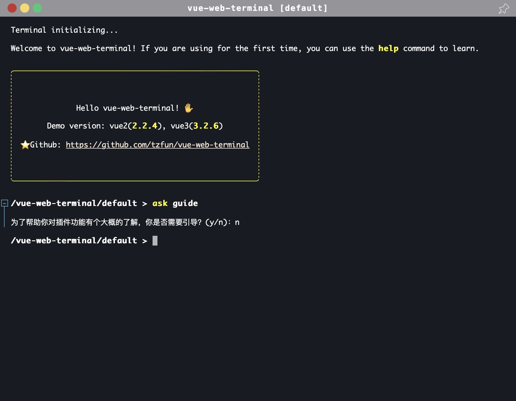
Light Theme
The plugin has a built-in light theme. To use it, just import the light css style.
import 'vue-web-terminal/lib/theme/light.css'
Example: 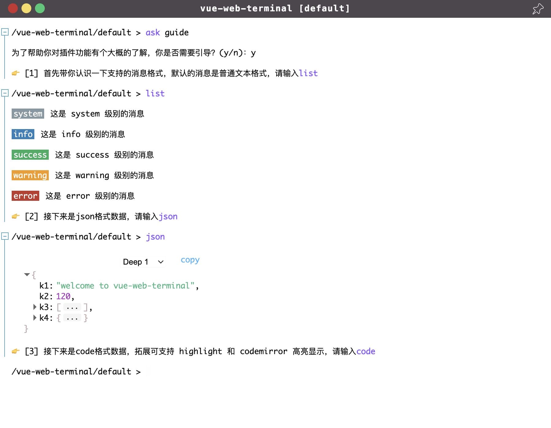
Customize Theme
The plugin implements themes by modifying the colors of different elements or modules. These colors are specified through css variables, so you only need to define the corresponding css variables. The following is the color definition of the dark theme.
:root {
    --t-main-background-color: #191b24;
    --t-main-font-color: #fff;
    --t-window-box-shadow: 0 0 40px 1px rgb(0 0 0 / 20%);
    --t-header-background-color: #959598;
    --t-header-font-color: white;
    --t-tag-font-color: #fff;
    --t-cursor-color: #fff;
    --t-cmd-key-color: yellow;
    --t-cmd-arg-color: #c0c0ff;
    --t-cmd-splitter-color: #808085;
    --t-link-color: antiquewhite;
    --t-link-hover-color: white;
    --t-table-border: 1px dashed #fff;
    --t-selection-font-color: black;
    --t-selection-background-color: white;
    --t-cmd-help-background-color: black;
    --t-cmd-help-code-font-color: #fff;
    --t-cmd-help-code-background-color: rgba(0, 0, 0, 0);
    --t-cmd-help-msg-color: #ffffff87;
    --t-cmd-help-box-shadow: 0px 0px 0px 4px rgb(255 255 255 / 20%);
    --t-text-editor-floor-background-color: rgb(72 69 69);
    --t-text-editor-floor-close-btn-color: #bba9a9;
    --t-text-editor-floor-save-btn-color: #00b10e;
    --t-text-editor-floor-btn-hover-color: #befcff;
    --t-json-background-color: rgba(0, 0, 0, 0);
    --t-json-value-obj-color: #bdadad;
    --t-json-value-bool-color: #cdc83c;
    --t-json-value-number-color: #f3c7fb;
    --t-json-ellipsis-background-color: #674848;
    --t-json-more-background-webkit: -webkit-linear-gradient(top, rgba(0, 0, 0, 0) 20%, rgb(255 255 255 / 10%) 100%);
    --t-json-more-background: linear-gradient(to bottom, rgba(0, 0, 0, 0) 20%, rgb(255 255 255 / 10%) 100%);
    --t-json-deep-selector-border-color: rgb(249 249 249 / 52%);
    --t-code-default-background-color: rgb(39 50 58);
    --t-log-box-hover-script-background-color: #2a2c34;
    --t-log-box-folded-background-color: #042f36;
    --t-log-box-folded-hover-background-color: #515157;
    --t-log-fold-icon-color: #4ca5c1;
    --t-log-fold-icon-background-color: #191b24;
    --t-log-fold-icon-border-color: #4ca5c1;
    --t-log-fold-icon-active-color: #191b24;
    --t-log-fold-icon-active-background-color: #4ca5c1;
    --t-log-fold-line-color: #4ca5c1;
}
If you need to implement your own theme style, you don't need to import any of the above css files. Create a new css file in your project, such as terminal-custom-theme.css, and then rewrite the above css variables in this file, and finally import it in the project.
import '~/your-style-dir/terminal-custom-theme.css'
Welcome to co-create the theme
The default themes provided by the plugin are relatively general and may not suit your preferences. If you have a better theme design and are willing to share it, you are welcome to share your theme design with the author or submit a Pull Request. Your design is likely to be selected as the default theme of the plugin and used by many developers~