
主题
从 2.1.13 和 3.2.0 版本开始,插件内置有两个主题:dark 和 light,并抽出一部分css变量,提供自定义主题的能力。
注意
在2.1.13 和 3.2.0 版本之前不支持主题功能,也无需引入相应css文件
黑暗主题
黑暗主题是插件的默认主题,也更符合大多数用户的使用习惯,要使用它只需在main.js入口处引入相应的css样式即可
import 'vue-web-terminal/lib/theme/dark.css'
示例: 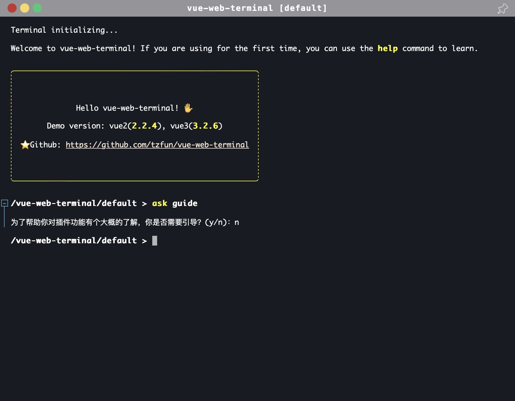
亮色主题
插件内置了亮色主题,需要使用它只需引入 light 的css样式即可
import 'vue-web-terminal/lib/theme/light.css'
示例: 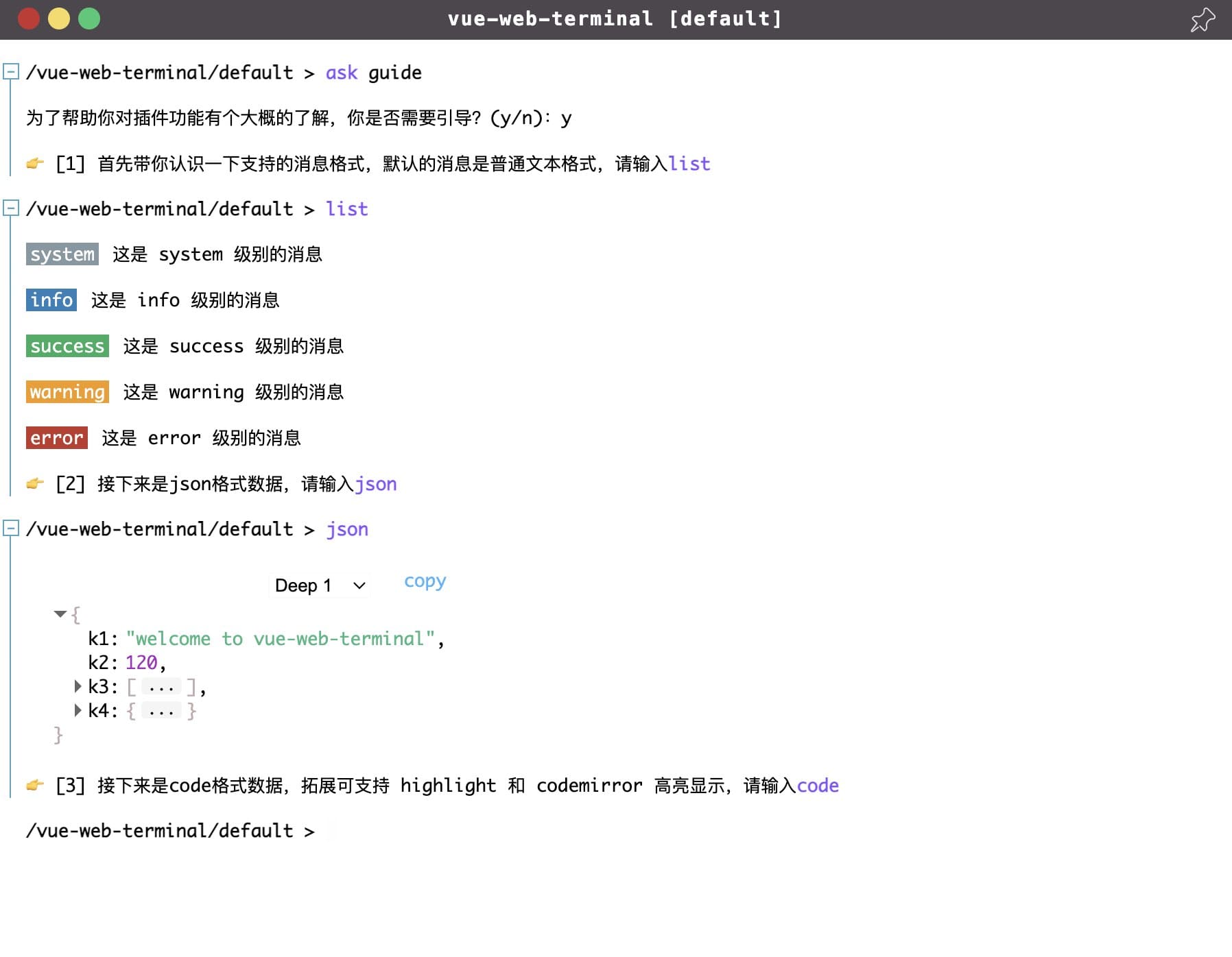
自定义主题
插件实现主题方式是修改不同元素或模块的颜色,这些颜色通过 css variables 指定,所以你只需要定义对应的 css 变量即可,一下是黑暗主题的颜色定义
:root {
    --t-main-background-color: #191b24;
    --t-main-font-color: #fff;
    --t-window-box-shadow: 0 0 40px 1px rgb(0 0 0 / 20%);
    --t-header-background-color: #959598;
    --t-header-font-color: white;
    --t-tag-font-color: #fff;
    --t-cursor-color: #fff;
    --t-cmd-key-color: yellow;
    --t-cmd-arg-color: #c0c0ff;
    --t-cmd-splitter-color: #808085;
    --t-link-color: antiquewhite;
    --t-link-hover-color: white;
    --t-table-border: 1px dashed #fff;
    --t-selection-font-color: black;
    --t-selection-background-color: white;
    --t-cmd-help-background-color: black;
    --t-cmd-help-code-font-color: #fff;
    --t-cmd-help-code-background-color: rgba(0, 0, 0, 0);
    --t-cmd-help-msg-color: #ffffff87;
    --t-cmd-help-box-shadow: 0px 0px 0px 4px rgb(255 255 255 / 20%);
    --t-text-editor-floor-background-color: rgb(72 69 69);
    --t-text-editor-floor-close-btn-color: #bba9a9;
    --t-text-editor-floor-save-btn-color: #00b10e;
    --t-text-editor-floor-btn-hover-color: #befcff;
    --t-json-background-color: rgba(0, 0, 0, 0);
    --t-json-value-obj-color: #bdadad;
    --t-json-value-bool-color: #cdc83c;
    --t-json-value-number-color: #f3c7fb;
    --t-json-ellipsis-background-color: #674848;
    --t-json-more-background-webkit: -webkit-linear-gradient(top, rgba(0, 0, 0, 0) 20%, rgb(255 255 255 / 10%) 100%);
    --t-json-more-background: linear-gradient(to bottom, rgba(0, 0, 0, 0) 20%, rgb(255 255 255 / 10%) 100%);
    --t-json-deep-selector-border-color: rgb(249 249 249 / 52%);
    --t-code-default-background-color: rgb(39 50 58);
    --t-log-box-hover-script-background-color: #2a2c34;
    --t-log-box-folded-background-color: #042f36;
    --t-log-box-folded-hover-background-color: #515157;
    --t-log-fold-icon-color: #4ca5c1;
    --t-log-fold-icon-background-color: #191b24;
    --t-log-fold-icon-border-color: #4ca5c1;
    --t-log-fold-icon-active-color: #191b24;
    --t-log-fold-icon-active-background-color: #4ca5c1;
    --t-log-fold-line-color: #4ca5c1;
}
如果你需要实现自己的主题样式,你无需引入上面任何一个css文件,在你的工程中创建一个新的css文件,比如就叫terminal-custom-theme.css, 然后在此文件中重写上面的css变量,最后在项目中 import 即可。
import '~/your-style-dir/terminal-custom-theme.css'
欢迎共建主题
插件默认提供的主题比较通用,不一定适合你的喜好,如果你有更好的主题设计并且乐于分享,欢迎将你的主题设计分享给作者或者提交Pull Request, 你的设计也很有可能入选为插件默认主题被广大开发者使用哦~